Illustrators / Characters and Brands
We get all kinds of print briefs here at Arcade and they usually sit in one of three categories.
PB: Our brand ‘Arcade’ is known for –
1. Making Shit happen (Ask us – we get the unusual that can’t fit on automatic machines printed by robots).
2. Waterbased Inks (So we do give a crap for our environment / waterways).
3. Having a sense of humour … we teach sometimes and get hundreds of new brands all the time – so our number 1 skill is having a laugh about it. We also print alot – but this is a by-product that happened by accident.
So read on with this in mind – The three customer categories …
NO.1 DON’T CARE / UN-BRANDED / PASSIVE – no defined communication.
The business that is just a business and they want T-shirts so they are either seen as doing something ‘advertising’ or they want uniforms so they can identify staff. These customers like ‘politicians’ buy shirts because ‘that’s what you do’ – usually the character of the shirt, wearers and the business are lost in a mandatory ‘Whack my logo on this mate – how much are they? – make it bigger’ sort of fashion.
We love these jobs – we like to focus in on colours and execution and getting it as cool as we can make it.
We just love the next people more.
NO.2 WE CARE – WE ARE A BRAND / PUSH – Brand positioning / Notice me / Separate from the viewer.
This business does something that takes skill – they express this skill in control over whatever they do so they want great t-shirts and they want the t-shirts to reflect their brand and the brand values as a sign, building or a car does. It says something about we are successful enough at our core product to be wanting to tell people more and will stand behind our brand. The brand is designed by designers and typeset and delivers the message and usually the phone number. The communication has a purpose – usually a sales / contact device.
Our character is precision and success – our products / services are executed well.
We love this company – he’s printing on good shirts – is choosing colours and words wisely.
Many of our customers are in this category – they come back every year – they appreciate the quality and we appreciate that they understand it and come back. At anyone time 80% of our work is return business.
NO.3 MY BRAND IS A REFLECTION OF YOU – MY CUSTOMER / PULL – attraction marketing.
The thinking here is about empathy with potential customers, personalisation of a product, product personality, customer avatars, being where your customer is, being aspirational to your customer, using language and styles your customer will relate to and ultimately being your customer.
This true personal touch is masterfully done these days by the hand illustrators and designers and especially when they are using illustrated characters in the communications. People relate to people, even if the character is a skeleton or skull or a known character that is clearly not the viewer but someone that represents their values in some way. In it’s most basic explanation – you may be attracted to a character as they may have a story –
That potential story makes them human.
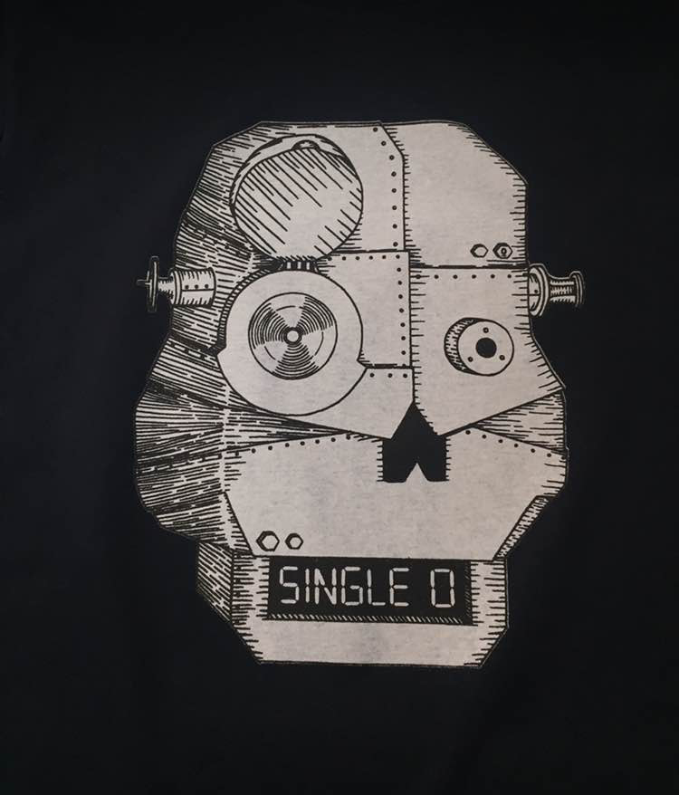
The brand Single O (Single Origin) Coffee from the ‘Robot’ above and the ‘Skeleton’ below are interested in clean tastes and very authentic product sourcing – creating and roasting the coffee themselves. If you look around their website of go into any of their stores – you can tell they are serious and good at what they do. You can admire them on many levels and this builds trust – a trust that every coffee will be good and they care that this is the case. They care about your customer experience. They know it’s personal.
We like to think ‘Single O’ print with us because Arcade are also hand craftsmen that care that our prints are great and their customers love the shirts and wear them often. We also use only waterbased inks that protect the customers, waterways and environment so this is a natural synergy and like mindedness. It’s that personal cross road … and luckily we both love art on T-shirts as very personal communications.
The robot above was on a ‘Single O’ t-shirt we printed a couple of times and is a hand drawn character. When people refer to it they want the the ‘Single O’ Robot’ and they say it with a smile. It’s not perfect like a graphic designer making a brochure – it’s messed up, it’s a natural line, it’s not even straight – the character is bent and hand made from patches of metal, probably from old coffee pots – it’s a unisex / trans cat / humanistic friend you could have a coffee with. Totally relatable – non threatening – cool.
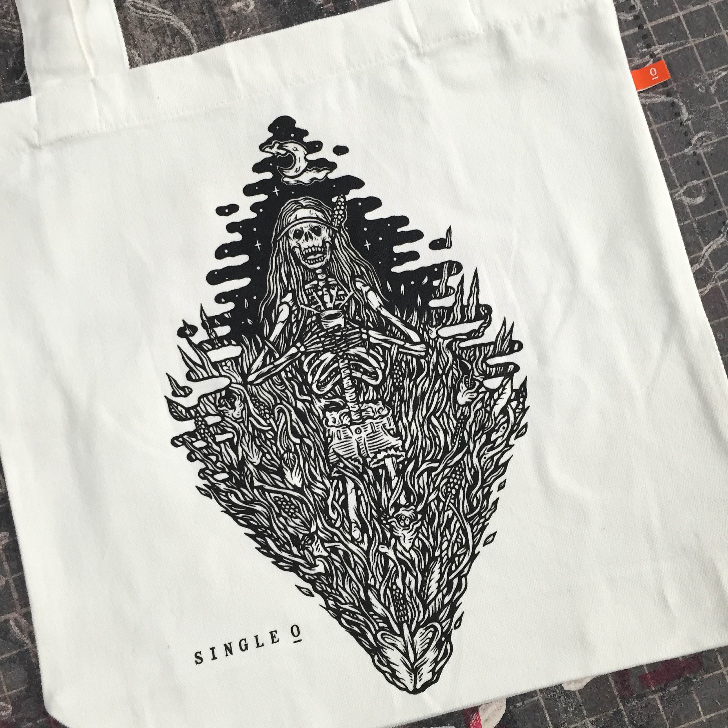
The bag below also for ‘Single O’ is another such character – illustrated by Kentaro Yoshida its seems a possibly feminine burning skeleton in a triangle of flames. Once again you look at it – smile, admire the hand illustration and you relate totally to the character – after all it’s 2016 – 1 in 5 people are actually burning skeletons. And once again it’s on an AS Colour Tote bag of superb ‘expected and delivered’ quality, printed with Arcades’ waterbased inks by a brilliant ink maker. We have a quality bag people will use again and again, and a character that is totally relatable, non threatening (except for the burning bit) & cool.
The moral of the story is – A professionally finished logo and good typesetting is nowhere near as much fun to drink with as a bent robot or burning skeleton chick. Cool stories about (and from) burning skeletons out number cool stories about logos (Sorry graphic designers) about 47 to 1. So if it’s social (Which coffee is) I want a ‘Single O’ because we’re all just hangin’ out really and they get it like I get it.
Kentaro Yoshida (Illustrator) is having a solo exhibition ‘Solo’ at ‘Goodspace Gallery’ opening next Wednesday the 14th September. To see more of his work try his website below or click the image above.
http://www.kentaroyoshida.com/